Reading Room WordPress Theme
October 7th, 2016
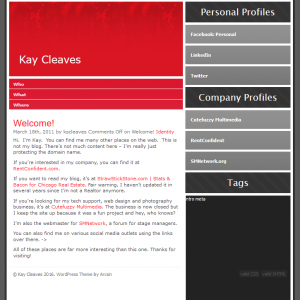
When I bought this domain way back in 2011 I never really intended to use it for anything. I was pretty much squatting on the domain name. I figured I would toss up a quick WordPress site so it led to somewhere but didn’t put much thought into how it looked or what it contained. I have used an old, outdated and insecure theme called Deep Red for years. I selected it quickly and without much thought because it was a) free and b) relatively pretty.
Deep Red doesn’t really reflect who I am anymore. It’s too traditional and boring. Given that this site is intended to be a showcase of what I can do as a developer I figured I would take the chance to make a WordPress theme that reflects my own style. If you want to see the result, well, look around you. This site is currently running the new Reading Room WordPress theme.
I don’t consider Reading Room to be part of the Scripts for Weirdos project. I have made WordPress Themes before. I have written PHP and CSS before. I’m not planning on posting the source code to Github – it’s kind of pointless without the book graphics, and I highly doubt anyone but me would want a StrawStickStone book adorning their site. However, it was a development project so it does earn a mention here. Especially since you’re soaking in it, as Madge would say.
Current design trends favor boxy stuff that tends to look uniform as you move from site to site. The need for responsive design that behaves in a similar way between all devices overrides a lot of the more flashy designs that dominated the pre-mobile web. However, I have always loved immersive, three-dimensional designs that make a webpage feel like a part of real life. I decided to make a WordPress Theme that was both responsive and sculpted.
I first went for a theme based on photos hanging on a wall, which I may go back to at some point. I’m not one for photographs myself though, so I didn’t feel that it suited me and scrapped the idea after a day. I am more of a book person. I next moved on to the idea of a bookshelf. The static homepage would be a real bookshelf and the inner blog pages would be an open book on a desk.
I found some book mockups for Photoshop over at Covervault. I adapted them to reflect my own tastes and experiences, along with a bit of humor. I learned to make cubes in Photoshop for the social media blocks on the homepage. I learned how to do Pop Art Roy Liechtensteinesque artwork and applied that to an old headshot of me that was taken at a networking event, and then used that for the Scripts for Weirdos cover.
For the book-on-tabletop blog part of the design I first laid everything out in Photoshop and then started slicing the pieces. The whole thing is done in CSS with almost no Javascript. The only Jquery I used is in the mobile version to make the clipboard slide in and out. I’ll probably re-edit the images to make them a little lighter but all-in-all I’m happy with how it turned out.
I got everything working the way I wanted and then moved on to WordPress-ifying it. This was relatively easy as it isn’t the first time I’ve converted a normal design into a WordPress theme. The preparations took me about a week, but making it into a theme took just over a day. Just take out the old chef’s knife and chop it up into sections and you’re all good. The toughest bit was actually the contact form, as I’d not really given any thought to styling Contact Form 7. I’m quite happy with how the final form turned out – making it look like a library book check-out card on the desktop version was a last minute bit of inspiration that took some finagling. Mobile versions don’t use the card, although they do still have a booky sort of styling done to the form.
While I was working on this theme I told my mother that it was the most graphically heavy design I’d ever done, and this is true. I am not normally a visual person so this was a major challenge for me. But at least it isn’t just another boring, traditional WordPress theme.
